Product Design · Virtual Reality
CurioXR: Educational VR
The best virtual reality experience requires an easy-to-use, intuitive, and responsive interface. CurioXR turns a clogged VR learning tablet into a seamless spatial system.
Role
Product Designer
Timeline
Jun–Aug 2023
Tools
Blender · UI Prototyping · Photoshop · Meta Quest
Platform
Meta Quest VR
The Creative Brief
From cognitive overload to confident learning
CurioXR's legacy spatial UI caused severe cognitive overload and physical interface fatigue for student users, leading to high drop-off rates.
By redesigning 7 core tablet interfaces into a unified, high-padding spatial ecosystem, we reduced interface fatigue, boosted learning session lengths, and increased school platform retention rates.
Problem Statement
Students were fighting the controls, not learning
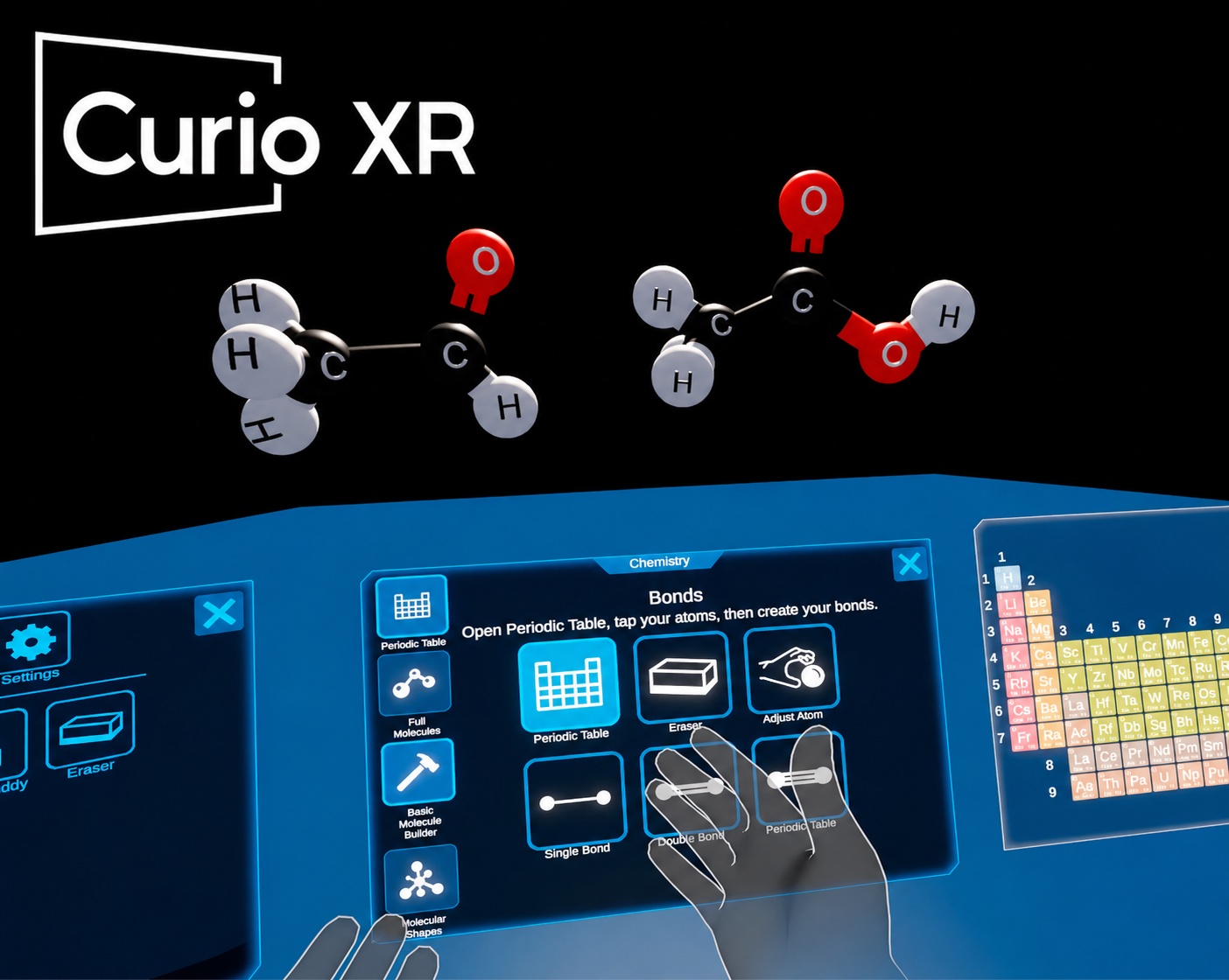
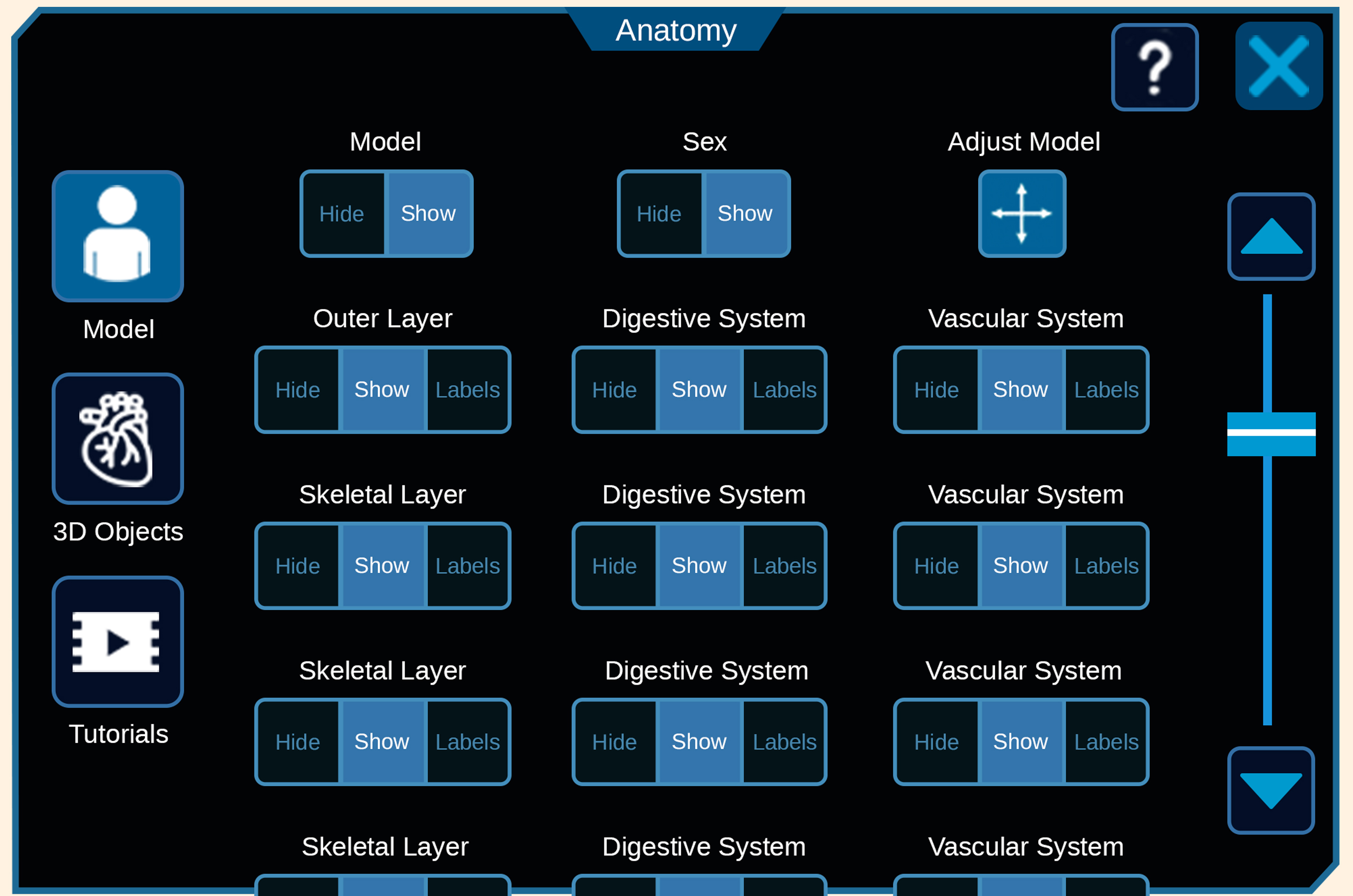
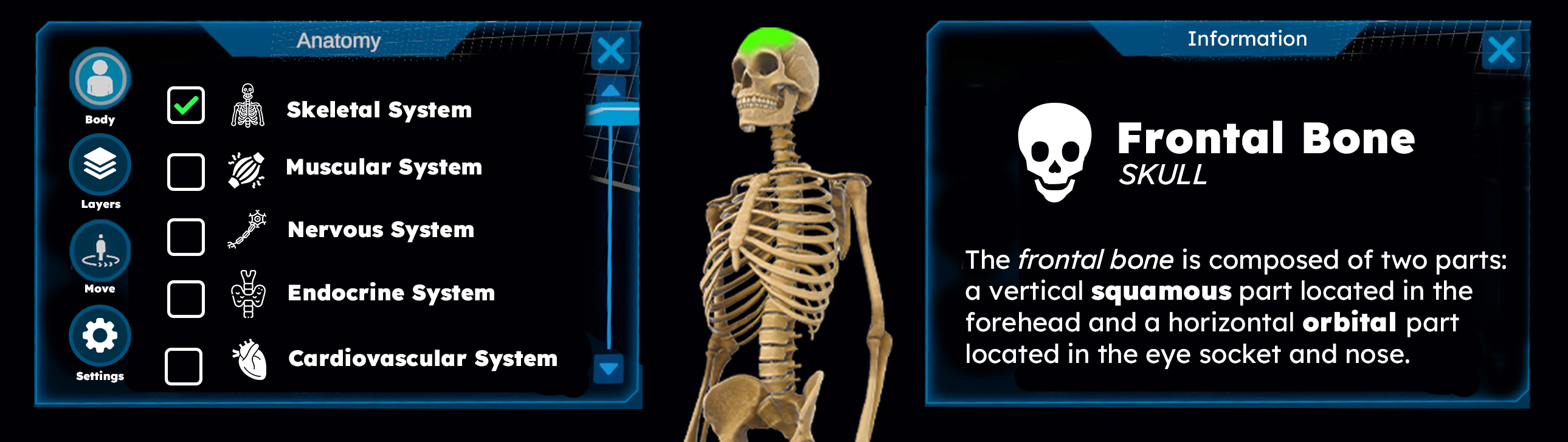
CurioXR serves student learners exploring subjects like chemistry and anatomy through interactive 3D assets.
But the cluttered, legacy UI meant students spent more time fighting the controls than interacting with those educational 3D assets — breaking the core value proposition of spatial learning.
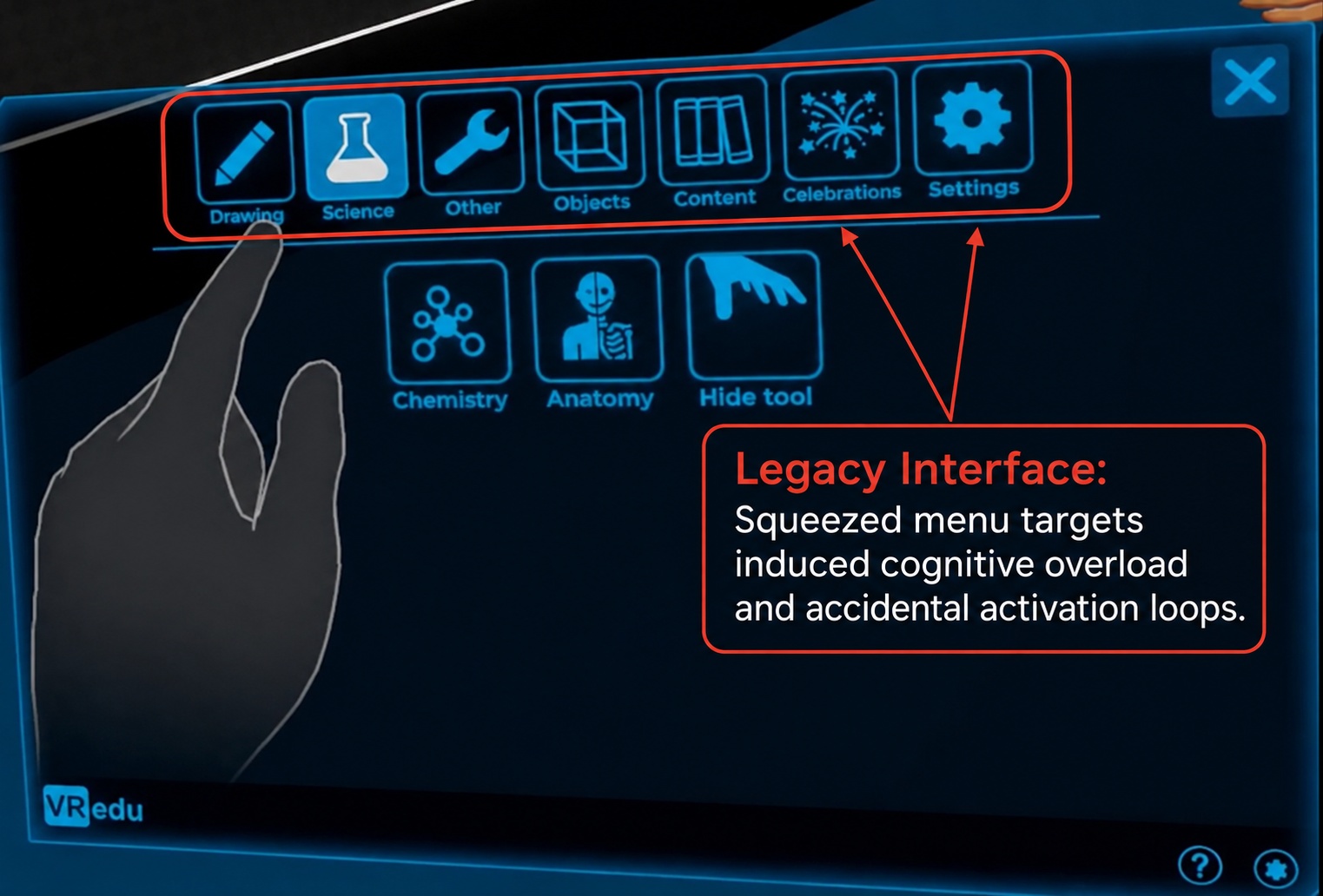
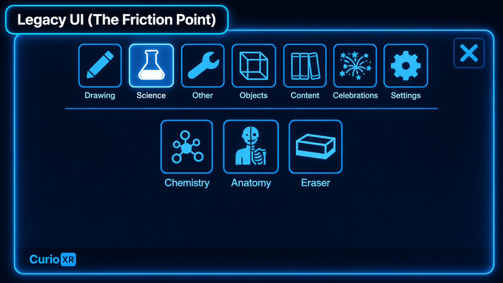
Legacy UI friction: crowded controls competed with the learning viewport, making it harder for students to focus on interacting with the 3D educational content.
According to spatial learning ergonomics research, excessive UI layer density causes a 30% surge in extraneous cognitive load for student learners.
By moving from a flat tablet framework to a high-contrast modal baseline, we stripped out tracking noise, ensuring students spend cognitive energy interacting with 3D educational assets instead of fighting interactive targets.
Craft & Production
A standardized pipeline for 3D spatial UI
Standardizing the wireframe-to-engine pipeline gave CurioXR a reusable global layout system, reducing handoff bottlenecks and helping the team deliver complex custom VR experiences faster across K-12 and university markets.
Build Process
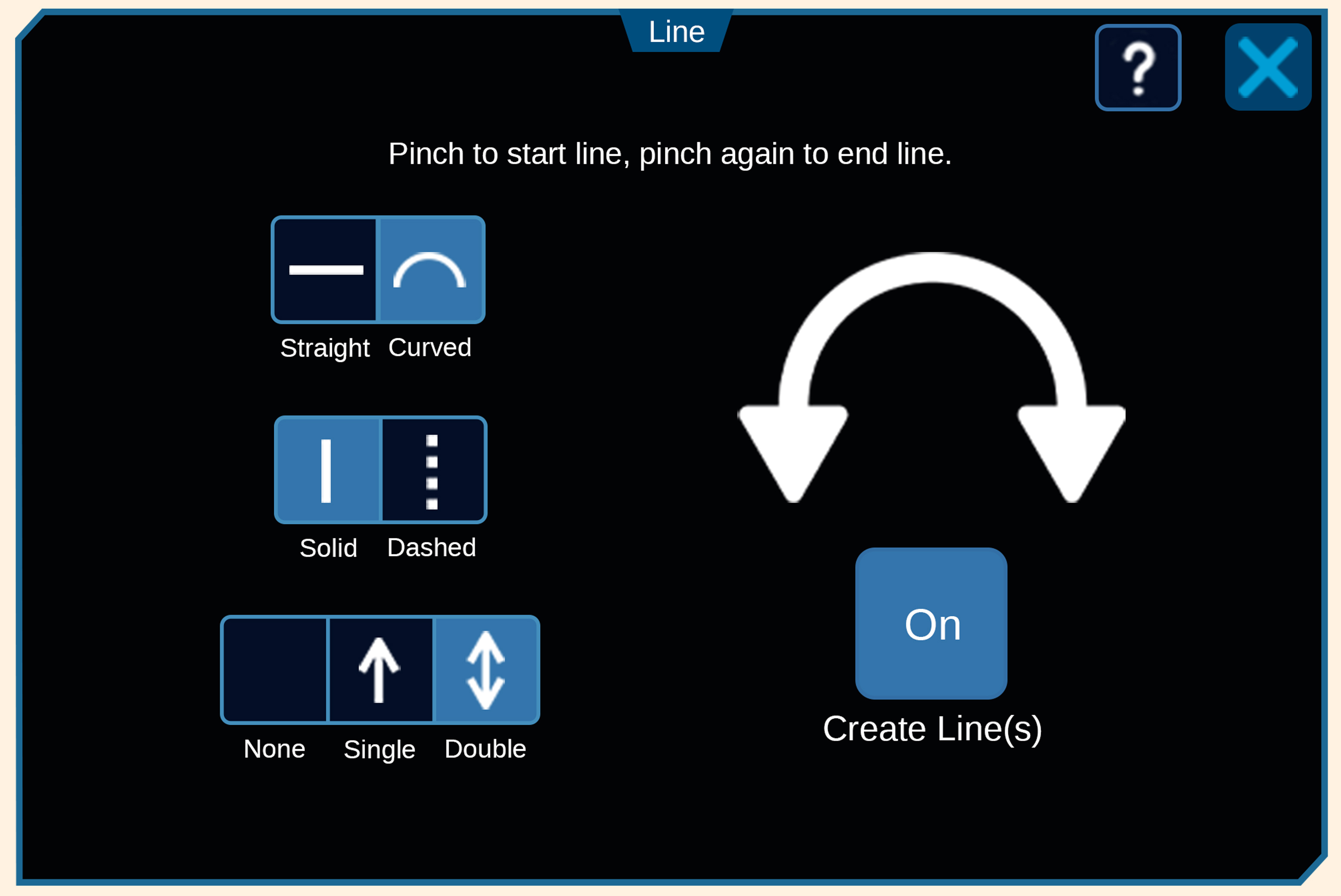
Designing VR-native interactions
Designing the tablet's interface also required developing user-focused VR functionalities — such as an inside-wrist button that triggers actions with animated audiovisual feedback.
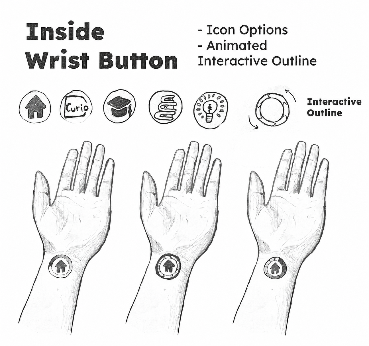
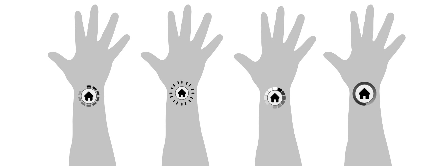
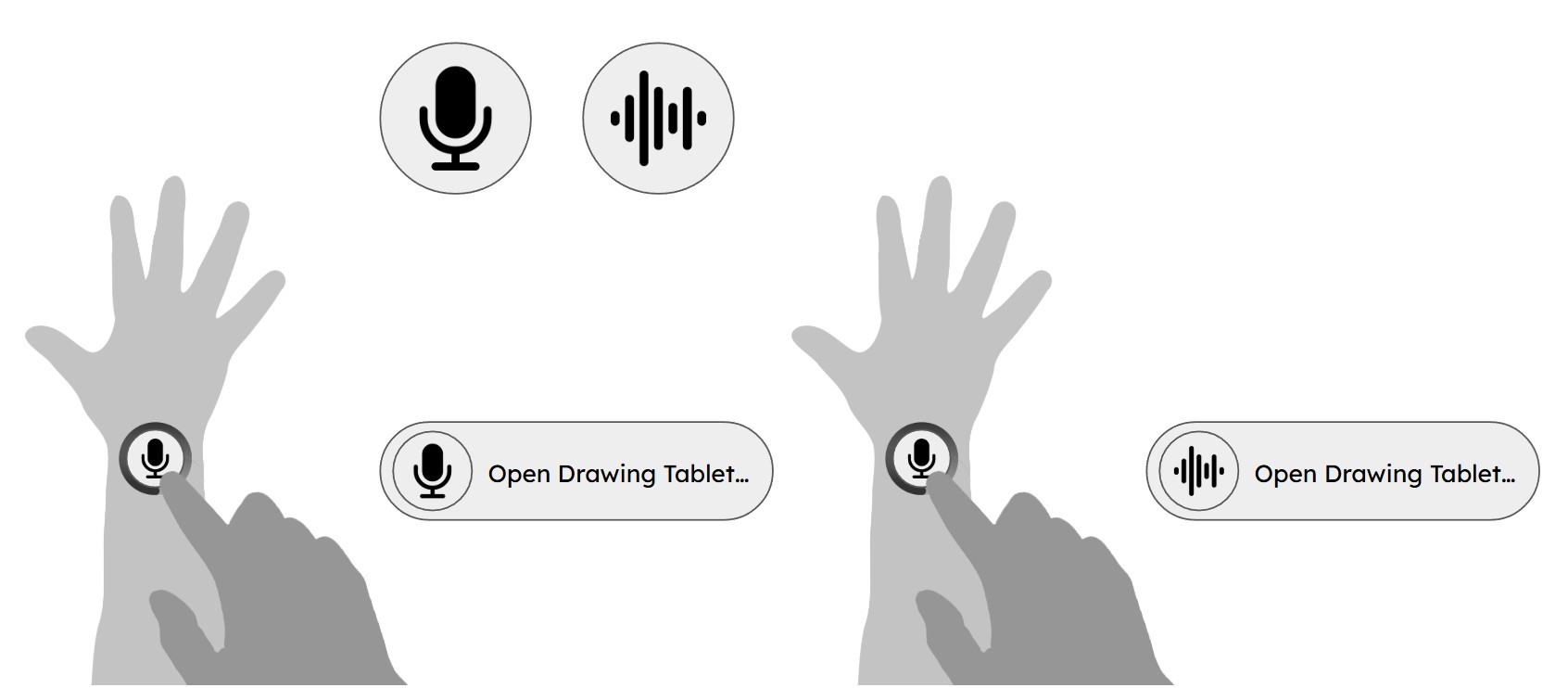
Increasing touch paddingTouch padding by 20% and reducing target thresholdsTarget threshold by 20% solved physical mis-tapsFewer mis-taps, aligning the interface with natural hand movementNatural hand movement and creating a smoother flowSmoother flow through deep science modulesDeep science modules.
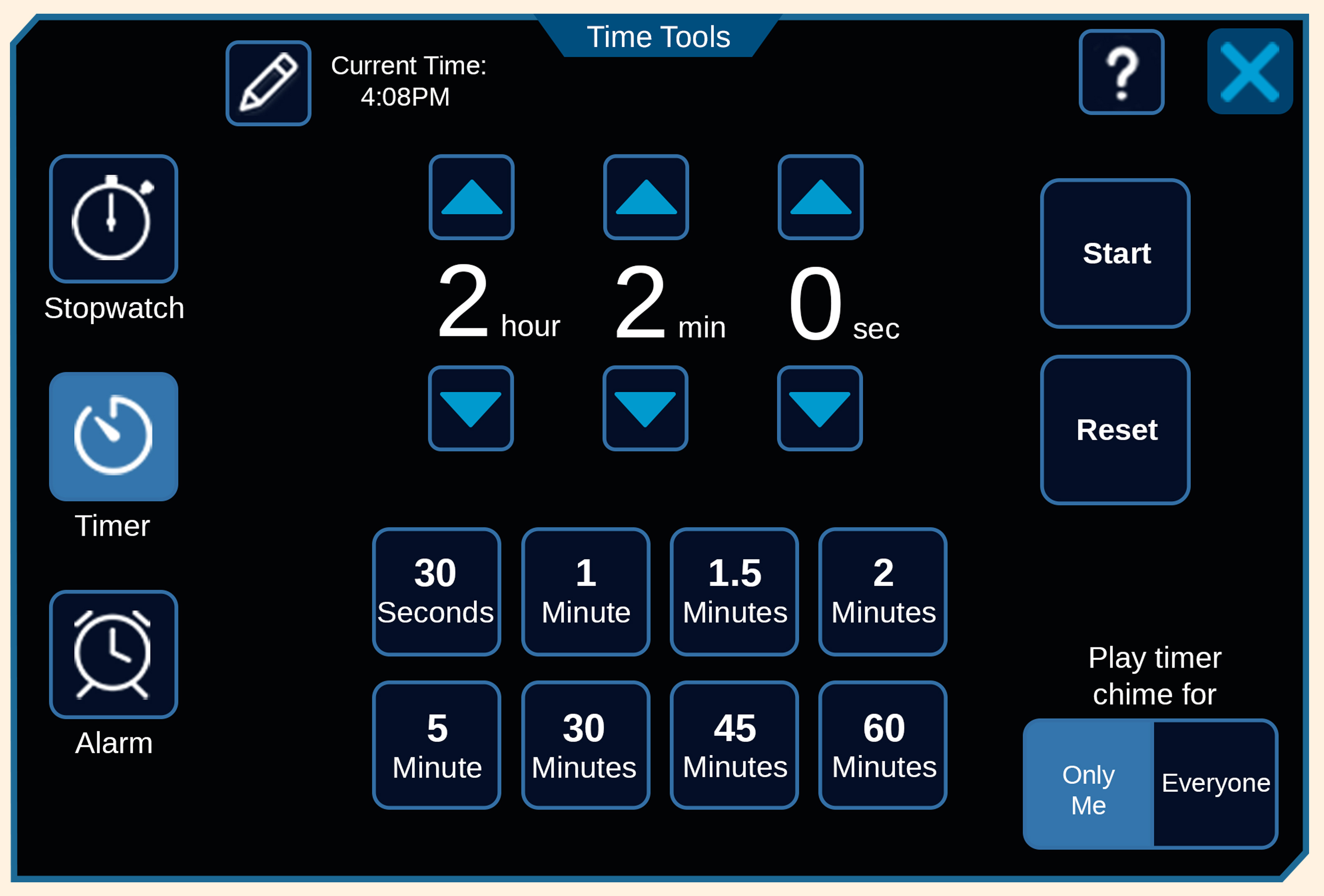
In-App Experience
The spatial tablet in action
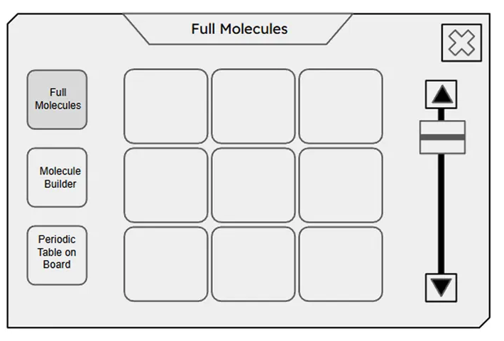
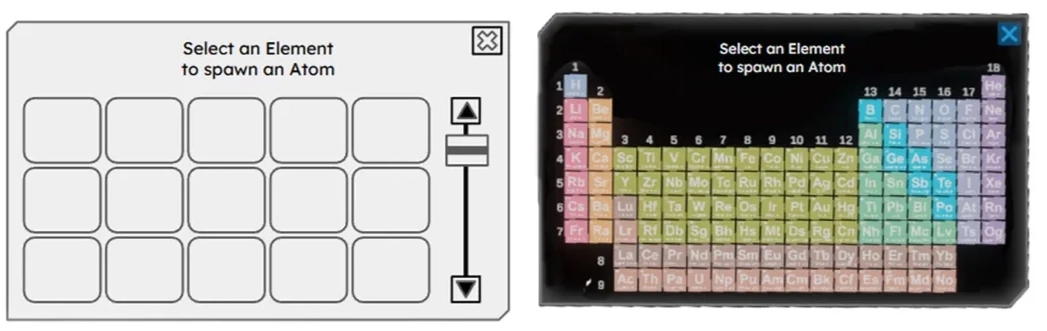
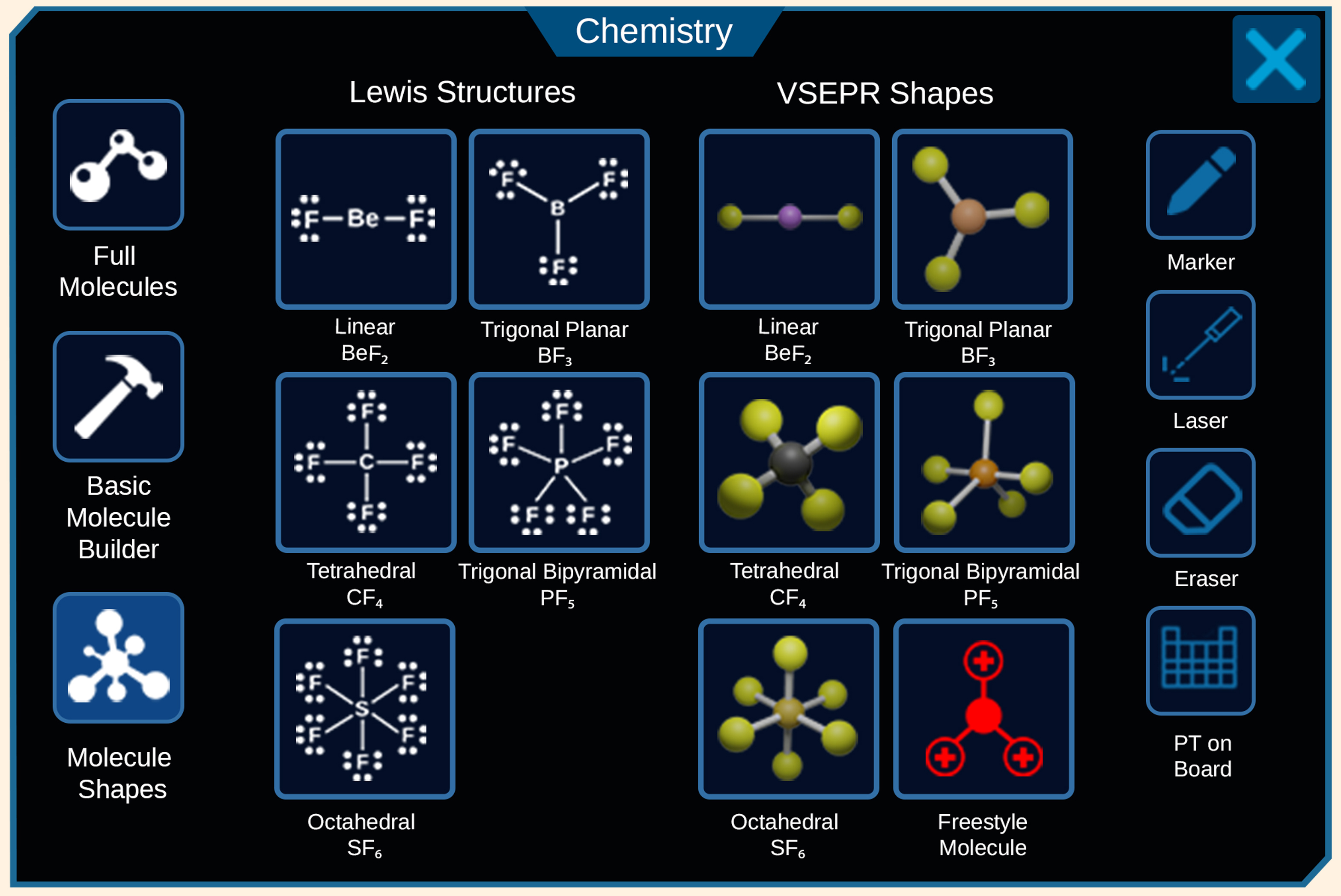
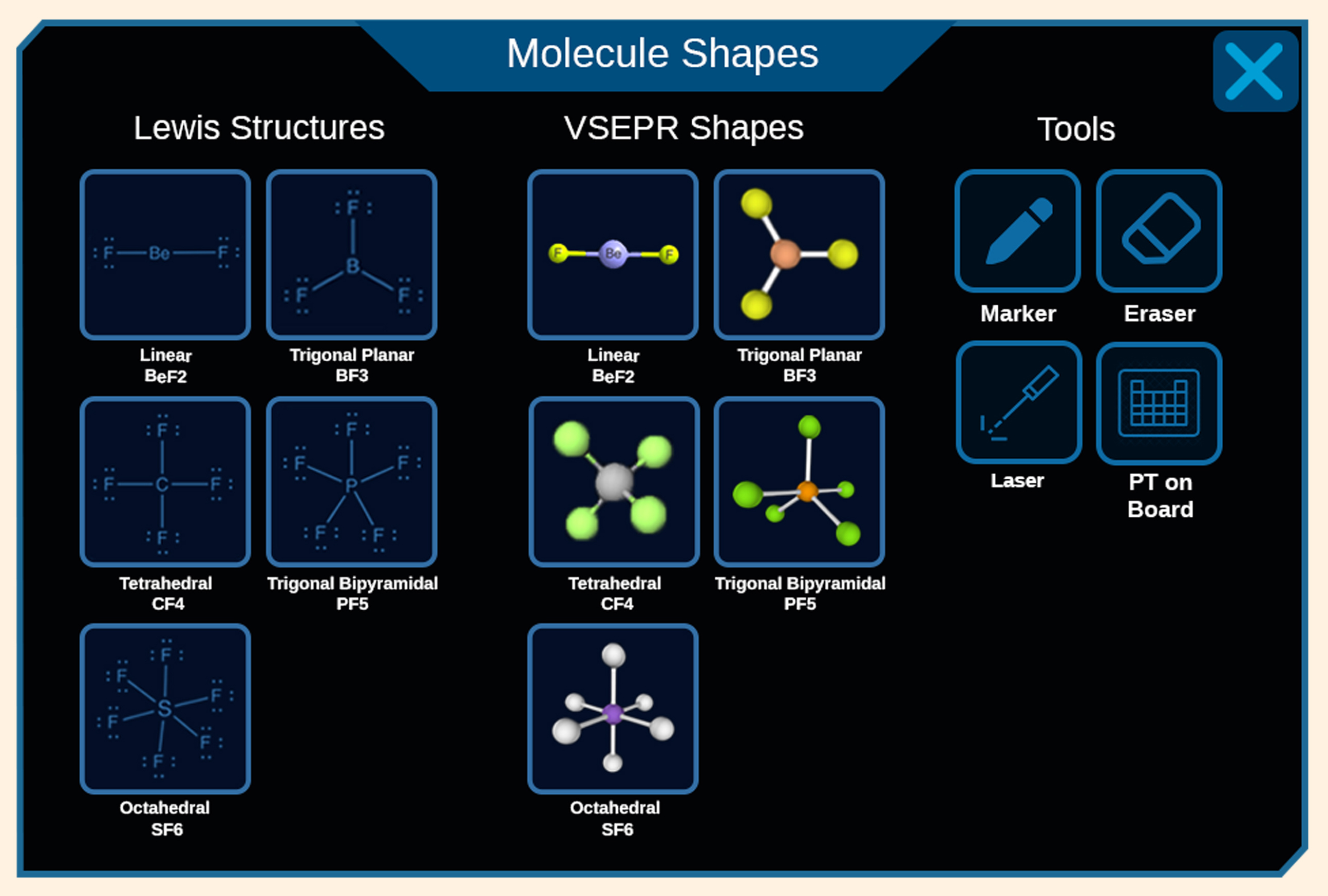
By designing a clean, low-friction interface, students seamlessly navigate tools to spawn and interact with 3D educational elements — like proportionally accurate atomic models — keeping attention on the learning canvas instead of the controls.
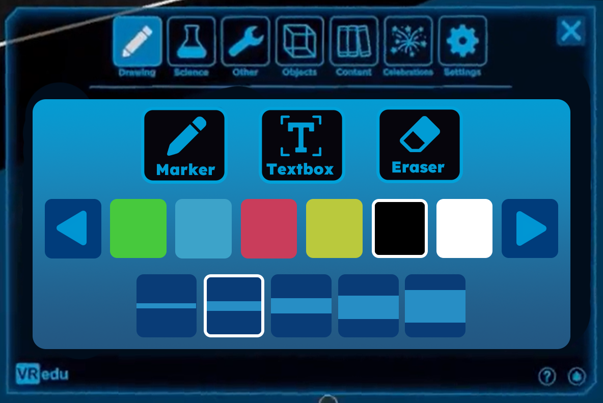
Active Learning Canvas
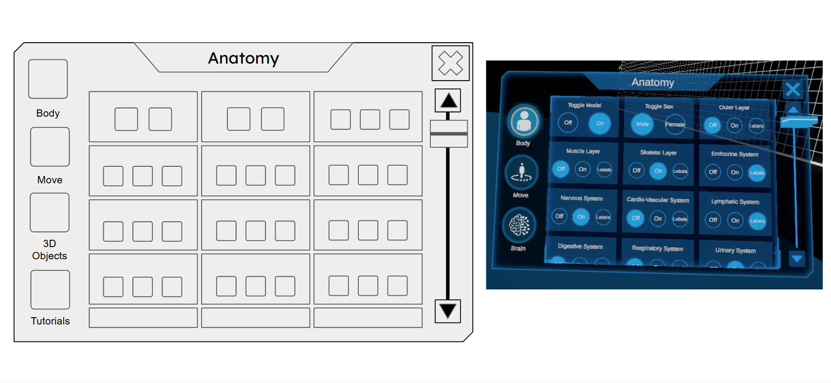
Consolidated tools, prioritized content
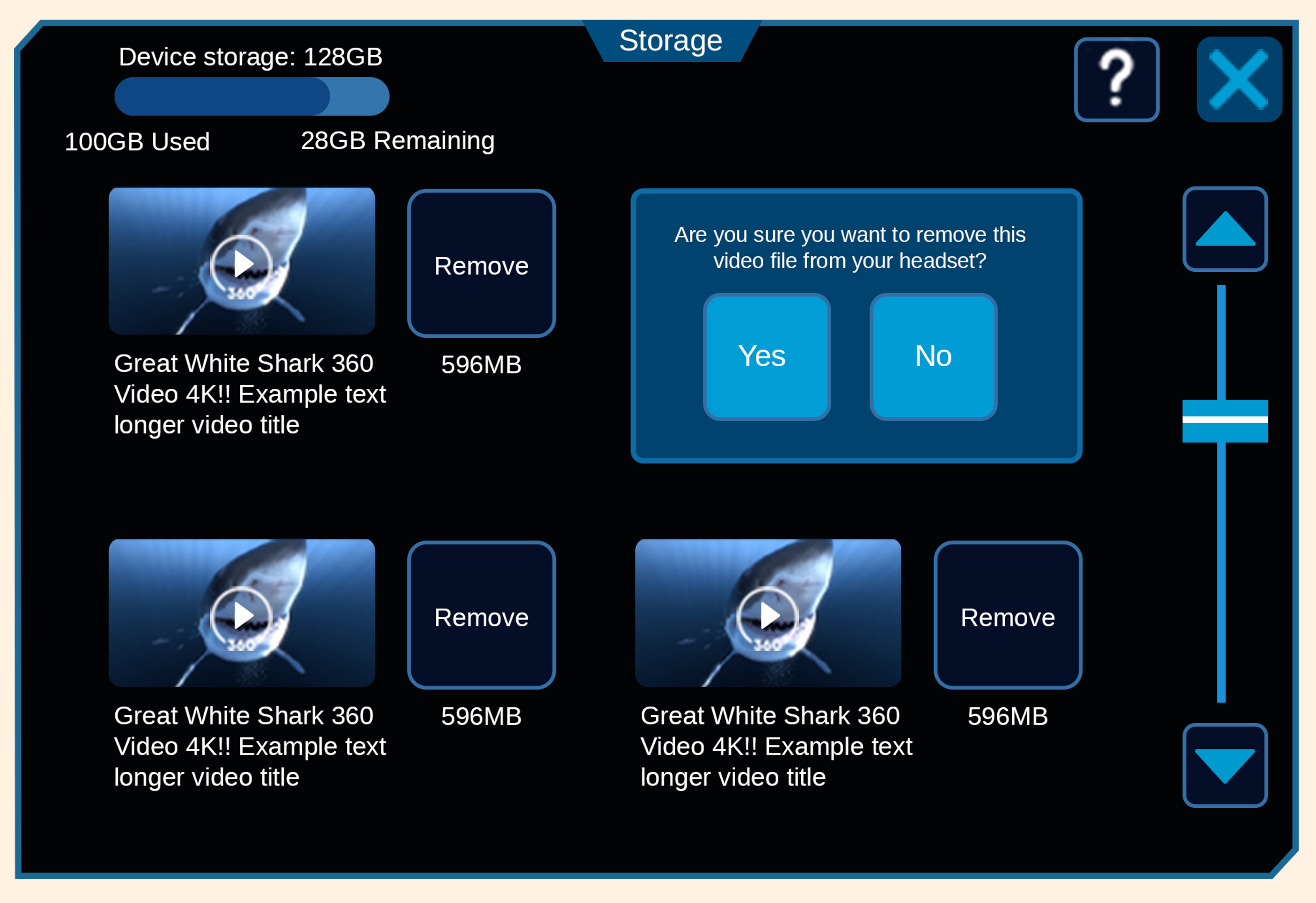
Consolidating 3D spatial models and utility tools into a standardized tab hierarchy reduced visual clutter and prioritized the active learning canvas — so students interact with educational assets, not menus.

A Unified Design System
One language across every utility dashboard
Consistent padding, type scales, and modal rules created a predictable system across admin, science, and drawing tools, reducing onboarding friction, extending headset sessions, and supporting district renewals.

20%
Reduction in Interface Fatigue (Optimized spatial target tap-accuracy)
7
Legacy Dashboards Unified (Consolidated into a singular intuitive design system)
1
Scalable UI Pipeline (Drastically reduced cross-functional development cycles)
Outcomes
What the redesign delivered
01
Reduced visual clutter
Consolidated 3D spatial models and utility tools into a predictable tab hierarchy that prioritizes the active learning canvas.
02
Faster wireframe-to-3D
A standardized button-template pipeline let the team convert low-fidelity wireframes into functional 3D spatial UI quickly.
03
Less interface fatigue
A 20% smaller button scale and logical grouping optimized spatial usage and comfort inside the headset.
Next project
Qetos